Goibibo fights seat selection
If you'd like to learn more, please get in touch.
Context
Seat selection in flights has existed for a long time. We didn't realise the need to look into it until the numbers started to decline because the users simply stopped selecting them while booking flight tickets. Also, a good amount of traffic comes from meta (websites like SkyScanner etc) and from there, users don't usually select add-ons (like seats, meals, etc).
Problem and opportunity
The major problem was that users weren't able to decide which seats to select. In case of multiple flights in a booking, a good number of users selected seats for the first flight and left the rest. As we inspected the flow, we found a lot of usability issues that were hampering the entire experience of seat selection.
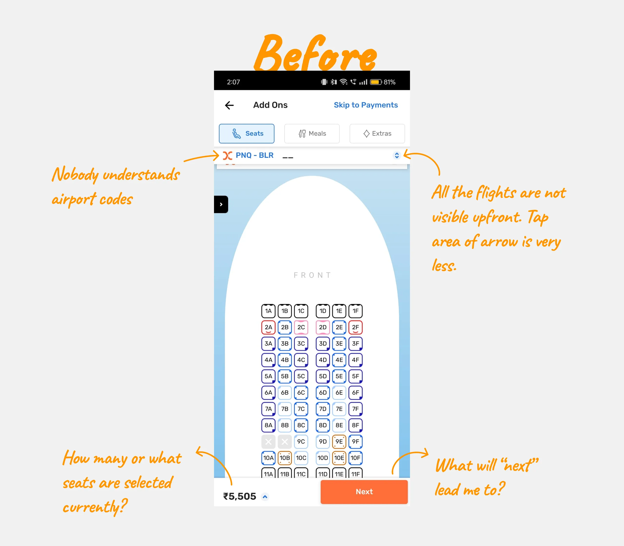
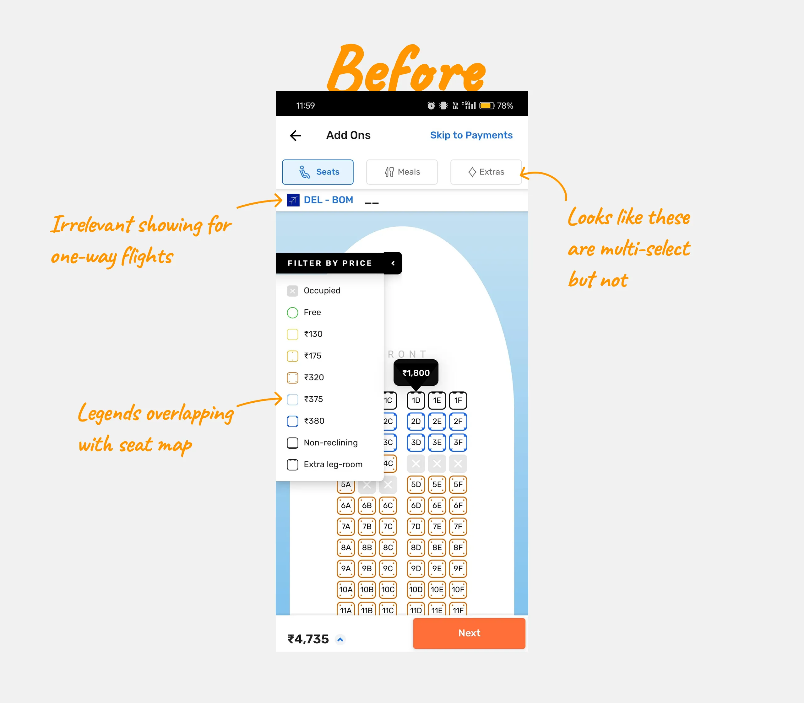
With the opportunity to rethink the seat selection flow holistically, we could guide different set of users in decision-making, personalise the experience and eventually help them select a seat and moreover, to take a scalable approach that could eventually be used in other flows like meals and other add-ons selection.
Goal
The primary goal is to guide users in selecting a seat by personalising the entire experience as much as we can. Also, to make sure in case of multiple flights in a booking, the user should select seats for all flights.
Scope
The scope was limited to redesigning seat selection flow only across desktop and mobile. Changing seat-map wasn't in scope and we were anyways replacing Goibibo seat map with the one from MakeMyTrip.
Explorations
We started focusing on the top header and bottom bar first as those were a bit tricky to solve. As the seat map needn't be changed, arranging the seat filters in the bottom seems the most intuitive way to solve for overlapping filters. While exploring the layout the primary goal was to present the information in the most intuitive way possible. Naturally, seats, meals, and extras can be shown as tabs. This was the base that we built our iterations upon.
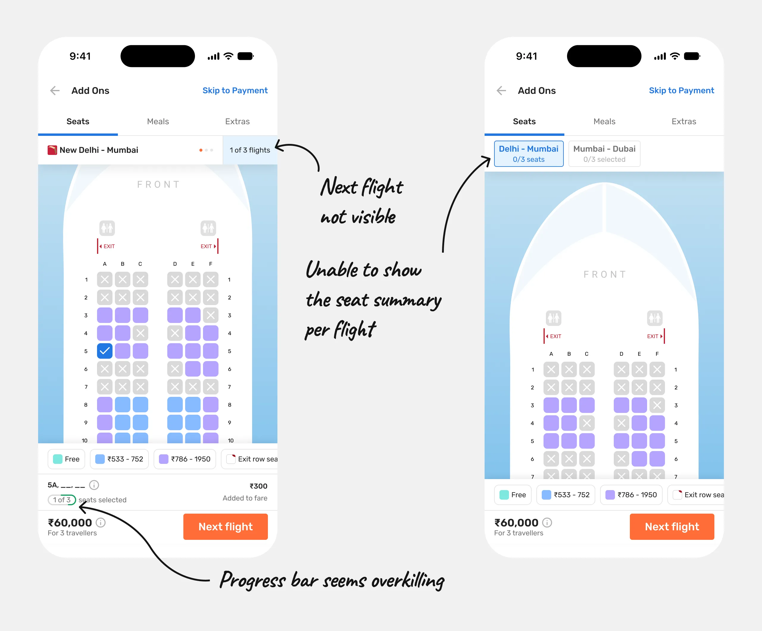
This was just a starting point. We went ahead and explored numerous iterations.
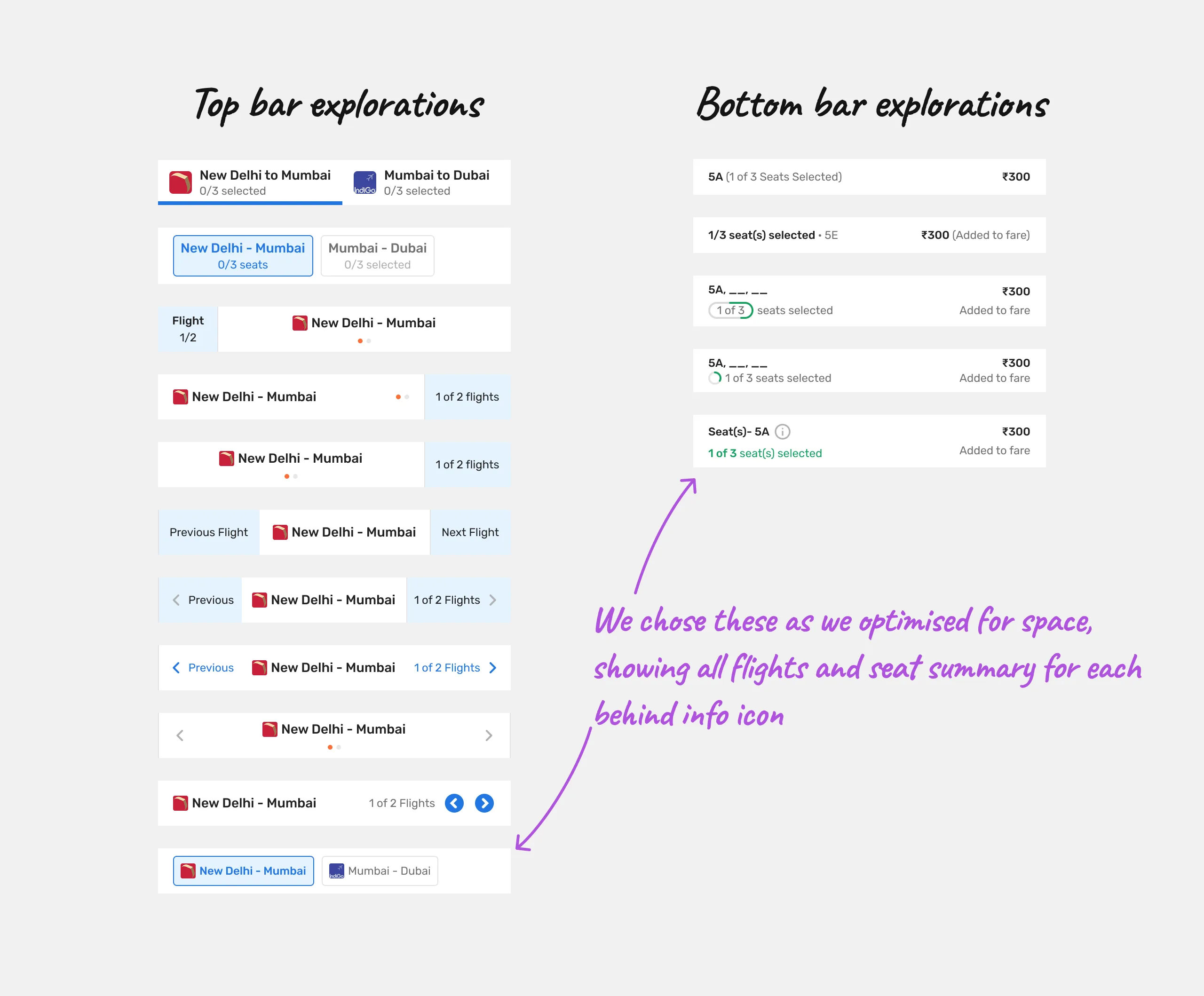
Although, there's always a room for improvement but the one we chose gave us the most optimised solve. I then started exploring how we would show persuasions to the user to select a seat. There are two aspects to it: to persuade a user to select a seat now or to persuade a user to select a seat recommended by Goibibo. Our initial idea was to just have the former only.
Solution
We wanted to guide users and not let them figure out which seat to select by themselves. So, we decided to follow the latter approach of first showing a persuasion as to why a user should select a seat now and then eventually guide them by recommending a seat in the seat map itself.
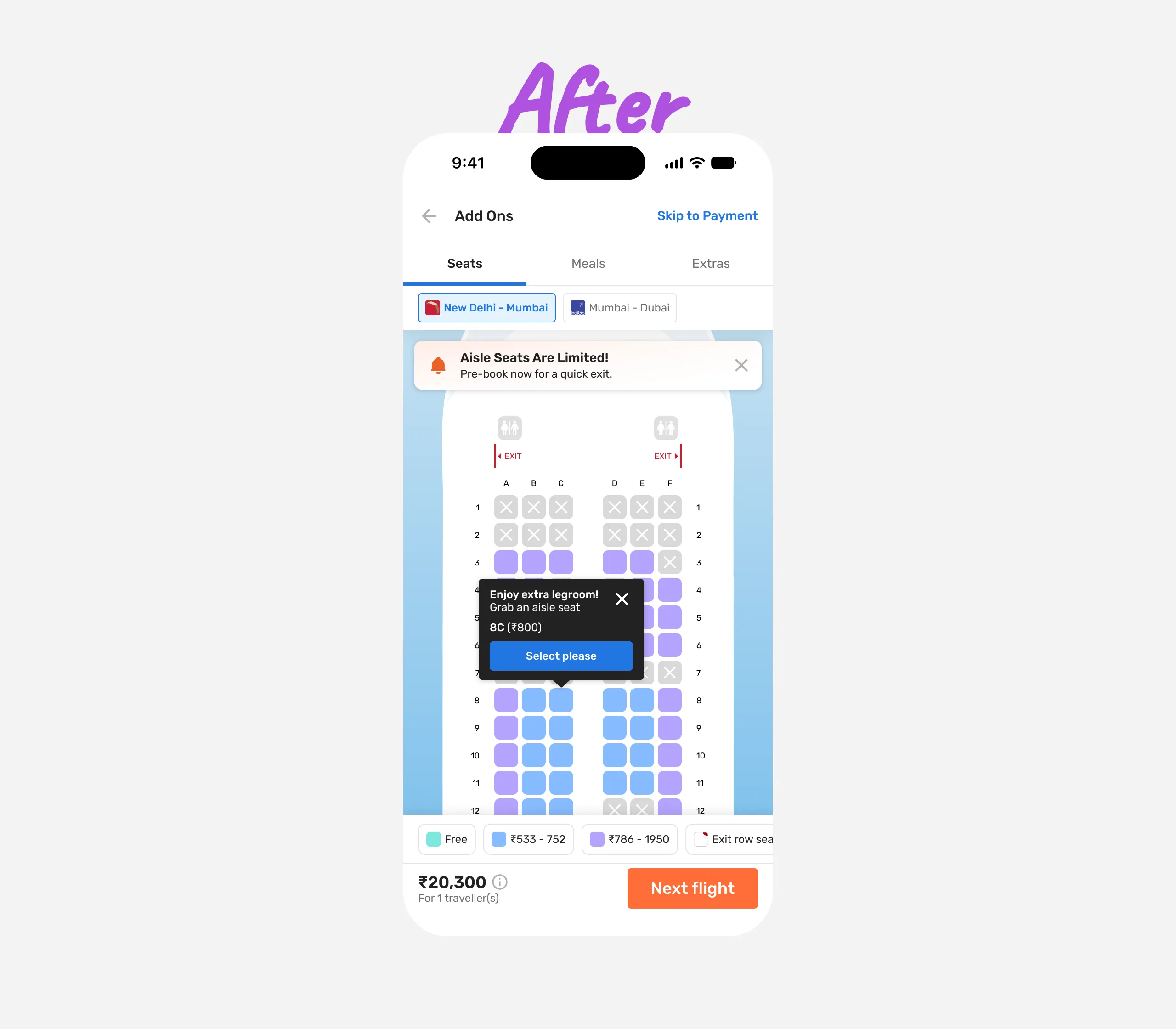
Given everything was aligned with what we wanted, I prototyped the flow in Figma to share within the team.
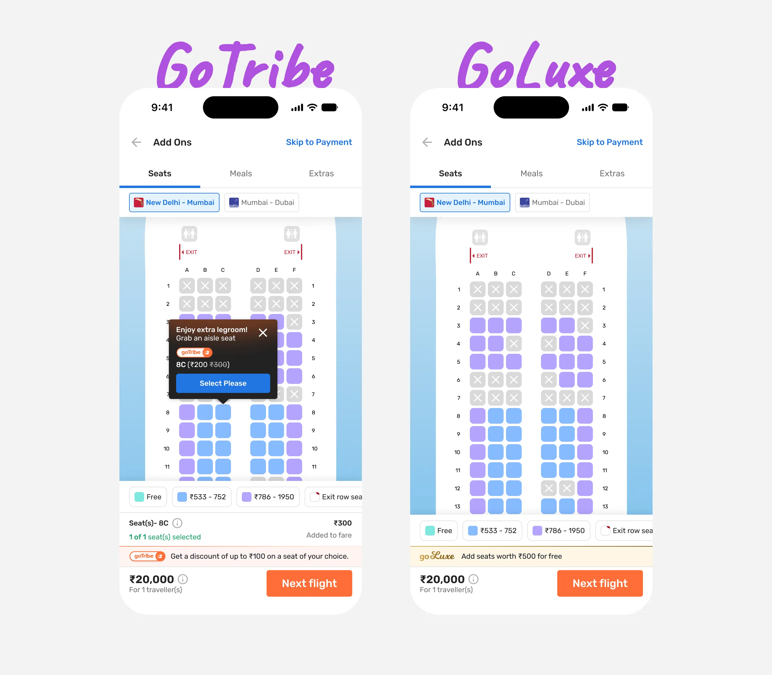
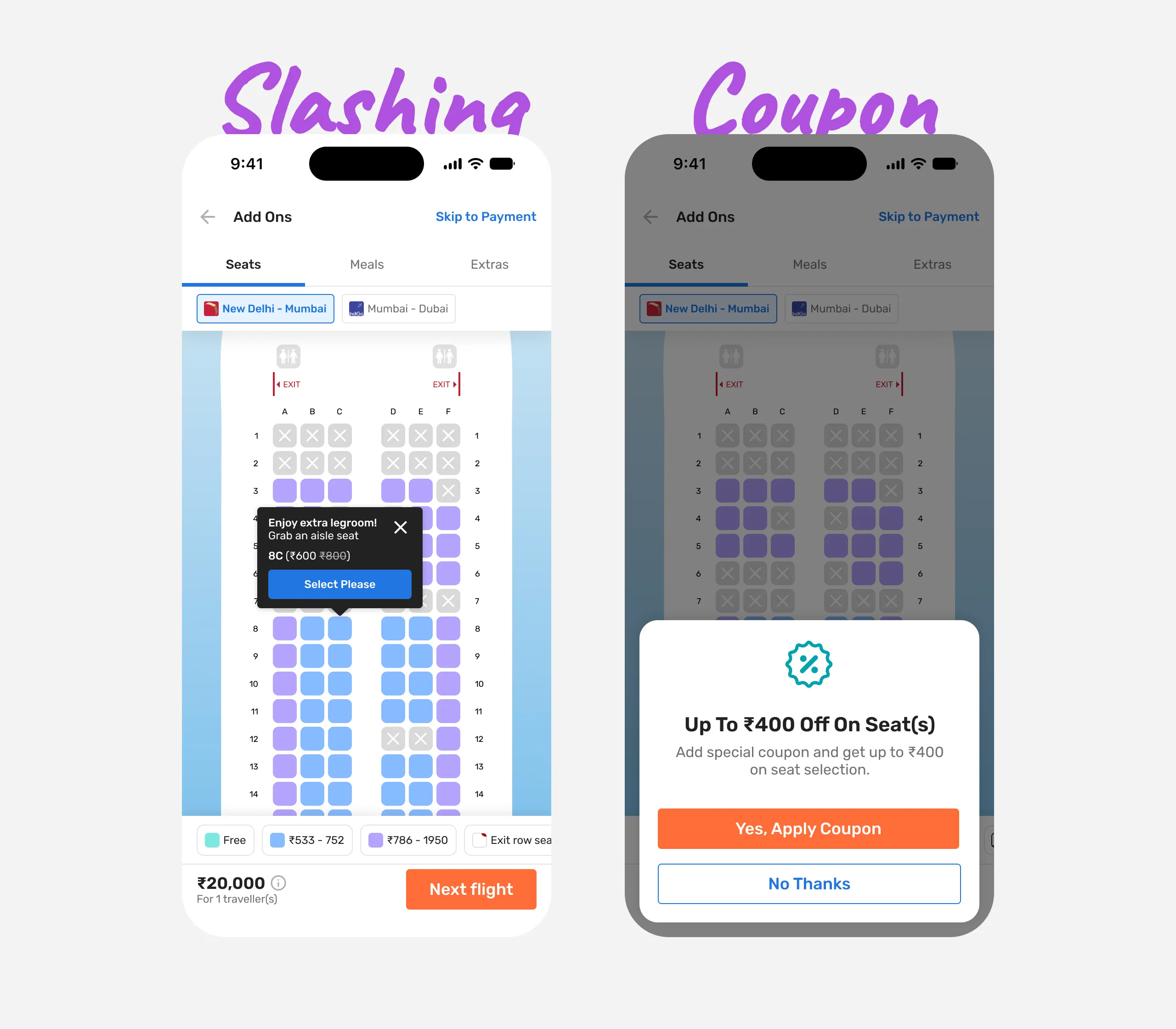
Now that we have cracked the base, all that is remaining is just handling of cases. We first started with seat discounting cases. Goibibo has 4 different types of seat discounting viz., two loyalty programs GoLuxe & GoTribe, one regular price slashing and the last is a seat coupon.
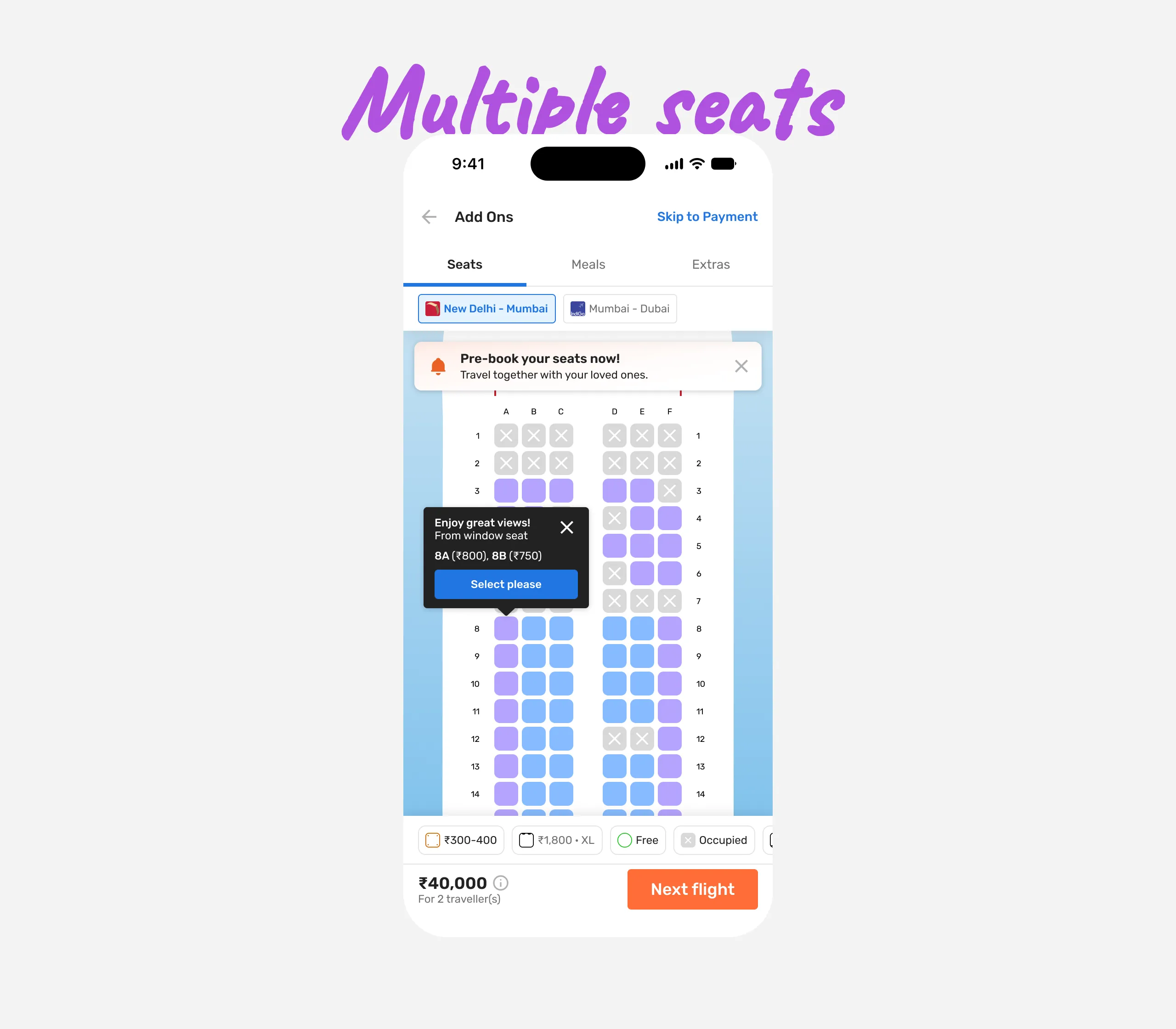
Next is multiple seats, this is how the persuasion tooltip will look like. On an average, a user usually books for 2 people.
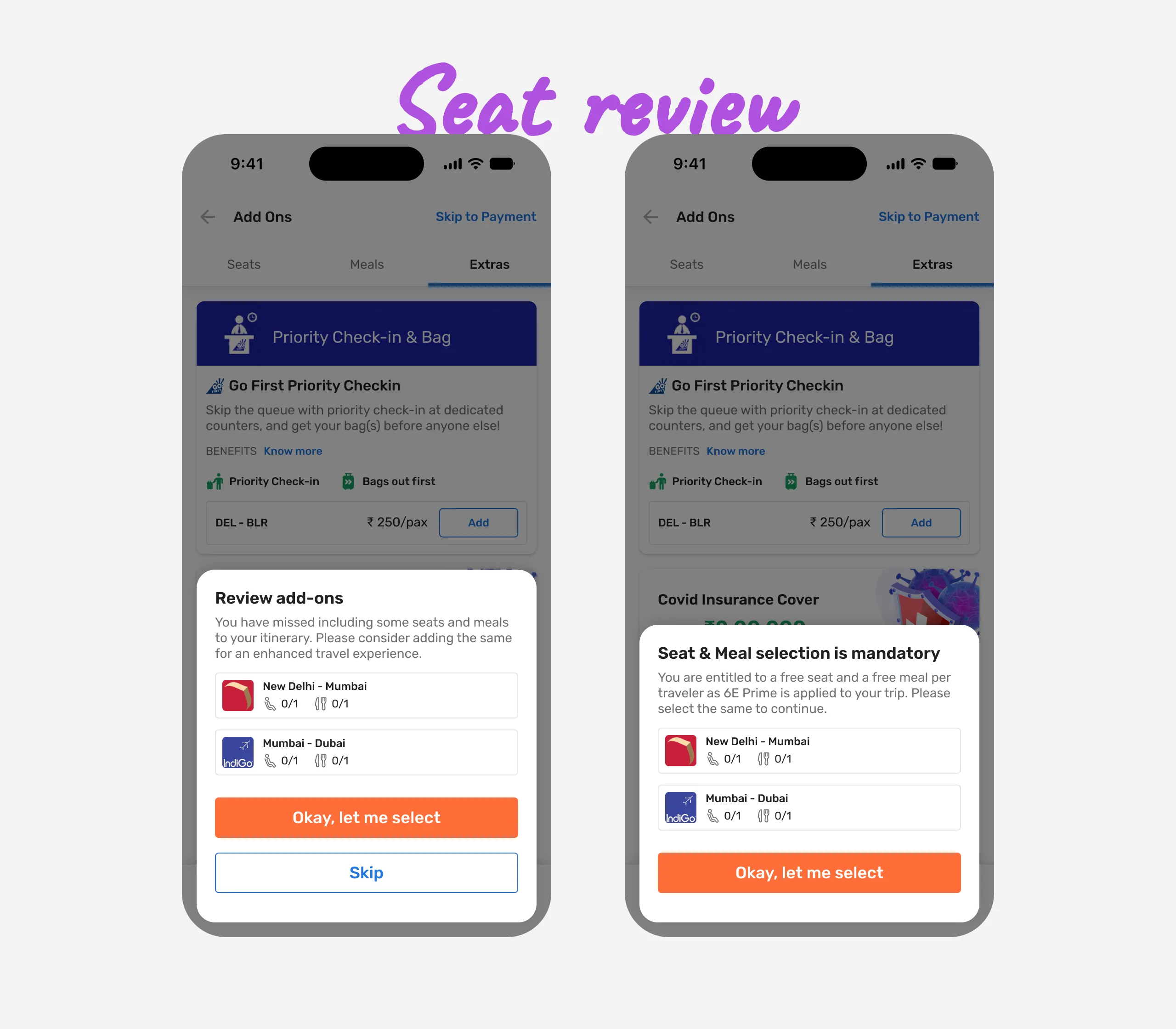
We still didn't stop here. Suppose a user didn't select seats for all travellers and/or for all flights (in multiple flights case), then just before the payment, we ask them for a confirmation if they want to go back and select seats for all travellers or continue with payment. If for an airline, seat selection is mandatory, then a user needs to go back and select seats before they continue with payment.
Conclusion
When it went live, we obviously saw an increase in numbers. Overall, there is nothing much to be traded off against. I learnt how to handle all the edge cases in such a complex flow of selecting even a single seat.